shopify header logo

A selection of examples of my work carried out as a Shopify Front End Developer on a large scale retail Shopify Platform, utilising Shopify's Liquid Templating, HTML, a standardised CSS class system, Vanilla Javascript and JQuery. All coding work was version controlled using Sourcetree and Bitbucket and peer reviewed by a Senior Dev and an external agency.

back to portfolio
shopify screenshot 1
Footer Redesign and Layout Optimisation

Tools & Tech: Liquid, HTML, CSS, Shopify Navigation Settings
Overview: Redesigned and implemented a responsive, UX-guided footer. Handled layout restructuring, accessibility improvements and the integration of new components such as mobile app download links and social icons.
Key Contributions:
- Rebuilt the footer using a responsive CSS grid system, ensuring optimal layout across desktop, tablet and mobile
- Standardised styling to align with the site's updated design system, including iconography, font usage and collapsible sections on mobile for a cleaner user experience without sacrificing content depth
- Implemented functional app download icons to drive traffic to the newly developed mobile app
Impact: Delivered a clean, modular structure to support future content updates and improve user navigation across devices.

shopify screenshot 2
Context-Aware Product Carousel for Mattress Compatibility

Tools & Tech: Liquid, HTML, CSS, Shopify Metafields, Custom Collections
Overview: Designed and developed a dynamic carousel component to reduce product return rates caused by incorrect mattress sizing. Utilised Shopify Metafields to create a scalable system where parent products automatically surface compatible child products via metafield-linked collections.
Key Contributions:
- Designed and implemented a metafield-driven system for parent-child product relationships
- Built logic to render a collection carousel using data selected from Shopify’s admin metafields dropdowns
- Collaborated with customer service and UX teams to align the feature with user pain points
Impact: Helped address a recurring customer service issue, resulting in a measurable reduction in mattress returns and improved customer satisfaction with the buying experience.

shopify screenshot 3
Dynamic Flyout Modal for Product Information

Tools & Tech: Liquid, HTML, CSS, Shopify Page Object, JavaScript
Overview: Enhanced the existing flyout modal used for the Price Match Guarantee by making its content editable through Shopify’s admin. This allowed non-developer staff to update the modal without developer support.
Key Contributions:
- Rebuilt the modal content area to dynamically pull from standard Shopify page object
- Improved the layout and styling to better accommodate FAQ-style collapsible sections
- Ensured mobile responsiveness and visual consistency with other site components
- Empowered internal teams (content and marketing) to manage updates independently
Impact: Streamlined the content management process and eliminated the need for developer involvement in basic copy changes. This gave the business more agility in responding to pricing policy updates and promotions.

shopify screenshot 4
Dynamic Product Information Elements

Tools & Tech: Liquid, HTML, CSS, Shopify Metafields
Overview: Developed dynamic product page sections that pulled key information—such as warranty and delivery details—directly from product-specific metafields. This ensured accurate, up-to-date messaging across a wide range of SKUs without manual content updates.
Key Contributions:
- Implemented custom metafields in Shopify Admin for warranty and delivery details, editable by non-developer staff
- Integrated metafields into the product page template using Liquid, displaying content only when relevant
- Used conditional logic to maintain layout integrity for products with or without the additional information
- Ensured content displayed consistently across all devices with responsive design tweaks
Impact: Improved the clarity of product information and reduced pre-purchase queries around warranties and shipping. Enabled non-developer teams to maintain accuracy across hundreds of SKUs while supporting customer confidence at the point of sale.

shopify screenshot 5
Store Opening Times

Tools & Tech: Liquid, HTML, CSS, Gadget.js, JSON Templates
Overview: Collaborated with an external dev to engineer a system to dynamically render store opening times on individual store detail pages using structured JSON templates managed via Gadget.js. This solution enabled non-developer staff to easily update regular and seasonal hours without the use of the previous CSV file format.
Key Contributions:
- Integrated JSON-based content fields with Gadget.js to manage and display store-specific hours dynamically
- Implemented logic to conditionally display seasonal hours, improving clarity for customers during holidays and special events
- Refactored store pages to consume a single template structure, ensuring consistency across all locations
- Provided clear documentation and backend tooling to empower content teams to manage updates autonomously
Impact: Reduced the time and complexity required to update opening times across the site, eliminated formatting inconsistencies and improved customer trust by ensuring accurate, timely information across all store detail pages.

shopify screenshot 6
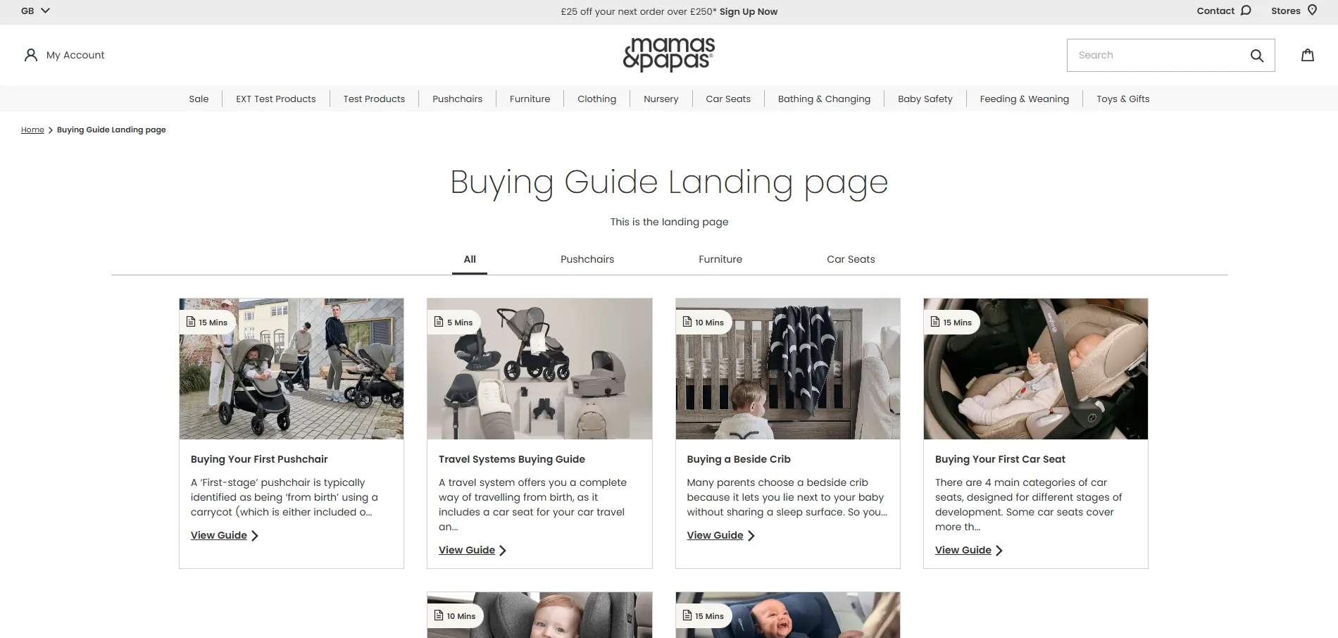
Buying Guide Landing Page with Dynamic Article Grid

Tools & Tech: Liquid, HTML, CSS, Shopify Metafields, Theme Settings
Overview: Developed a custom Buying Guide landing page to replace Shopify’s native blog structure, offering a more flexible and scalable solution for product education content. The landing page featured a dynamic article grid filterable by category, aimed at improving content discoverability and user experience.
Key Contributions:
- Built a JavaScript-powered filtering system that allowed users to sort guides by category without page reloads
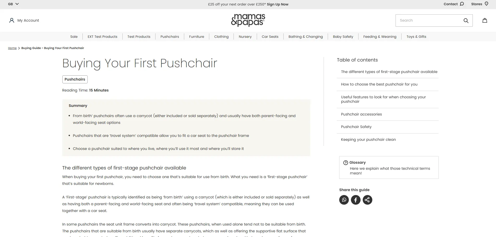
- Utilised Shopify Metafields to populate article data (title, thumbnail image, category) from individual article pages
- Designed and implemented a responsive grid layout that adapted seamlessly to mobile, tablet, and desktop views
- Created a scalable structure allowing new guides to be added and surfaced on the landing page via backend-only metafield updates
Impact: Replaced the rigid blog setup with a maintainable, UX-optimised system, improving guide visibility and user engagement. Empowered non-developer staff to manage new content through Shopify metafields, reducing reliance on developers and enhancing SEO strategy through improved content structure.

shopify screenshot 7
Buying Guide Article Page: Modular Layout with Fixed TOC

Tools & Tech: Liquid, HTML, Custom CSS, Shopify Metafields, Theme Settings, JQuery
Overview: Architected a fully modular article page template for buying guides, designed around a 70/30 content layout with a fixed-scroll table of contents. This provided a clean, editorial-style reading experience while remaining fully editable by content teams in the Shopify Customiser.
Key Contributions:
- Collaborated closely with UX designers to translate static wireframes into a dynamic and editable page structure
- Engineered a workaround to Shopify's section/block limitations by nesting article “sections” as configurable blocks within a single custom section
- Developed a fixed-position table of contents that synced with each content block using JavaScript scroll behavior
- Ensured responsive layout integrity across breakpoints while preserving editability for non-developer users
Impact: Delivered a highly flexible and UX-forward content template that empowered internal teams to build visually rich, long-form buying guides without developer support. The modular structure drastically improved design consistency and scalability across future articles.

shopify screenshot 8
Buying Guide Article - Fixed Scrolling Contents

Tools & Tech: Liquid, HTML, Custom CSS, Shopify Metafields, Theme Settings, JQuery
Overview: Implemented a dynamic, fixed-position table of contents (TOC) component for buying guide article pages to improve navigation and readability. The TOC tracks user progress and allows instant jumping to different sections of the article. This solution allowed for non-developer content staff to quickly and easily build and maintain each article.
Key Contributions:
- Used Metafields to dynamically pull the block titles and generate the table of contents based on the structure of the article
- Integrated custom jQuery to highlight the active section title based on the user’s current scroll position
- Collaborated with the UX team to ensure the table of contents was intuitive and aligned with the article’s content layout
- Ensured mobile responsiveness with collapsible behavior and minimized UI clutter while preserving functionality
Impact: Improved long-form content navigation, reducing bounce rates and increasing user engagement on detailed guides. Empowered content teams to structure their own TOCs with zero code, while providing readers with a seamless, anchored browsing experience.

shopify screenshot 9
Buying Guide Article - Dynamic Tabbed Comparison Table Component

Tools & Tech: Liquid, HTML, Custom CSS, Shopify Metafields, Theme Settings, JQuery
Overview: Built a dynamic, tabbed comparison table for use within buying guide articles to present bullet pointed product specifications or features side-by-side. Each tab controlled its own version of the table, allowing users to toggle between datasets without reloading the page.
Key Contributions:
- Developed a custom Shopify block to manage each table tab’s content independently through the theme customiser
- Implemented tab-switching functionality in JavaScript to dynamically render the correct table without reinitialising the DOM
- Designed the table layout to be mobile-friendly while preserving readability and functionality
- Ensured responsive table sizing based on the number of table bullet points
Impact: Enabled clearer product comparisons within guides, enhancing user decision-making and engagement. Gave content teams a flexible, reusable component to present complex data visually, all manageable via Shopify's native admin interface.

shopify screenshot 10
Buying Guide Article - Numbered Information Boxes Block

Tools & Tech: Liquid, HTML, Custom CSS, Shopify Metafields, Theme Settings, JQuery
Overview: Created a reusable Shopify block to display up to six key pieces of information in clean, numbered boxes. Designed to enhance scannability in buying guide articles and visually break down processes or benefits into digestible parts.
Key Contributions:
- Built a custom block that allowed content editors to add between 1–6 information boxes via Shopify’s theme editor
- Designed logic to automatically hide empty boxes, keeping the layout clean regardless of how many boxes are used
- Styled the block to match the guide’s overall design system, ensuring consistency across different article types
Impact: Improved content clarity and engagement by visually chunking information into easy-to-read steps or highlights. Gave non-technical staff a versatile, layout-safe tool to structure important guide content with no need for custom coding.

shopify screenshot 11
Buying Guide Article - Flyout Glossary Modal

Tools & Tech: Liquid, HTML, Custom CSS, Shopify Metafields, Theme Settings, JQuery
Overview: Developed a glossary flyout modal designed to support customer education by explaining technical or industry-specific terms used throughout buying guide content. The modal improved clarity without disrupting the reading flow.
Key Contributions:
- Engineered the modal to dynamically pull its content from the page.content field in Shopify, allowing easy editing by non-developer staff
- Created a toggleable flyout design that overlays the current page, ensuring accessibility without navigating away from the guide
- Styled the modal for readability and visual consistency with the broader guide design system
Impact: Improved customer comprehension of complex terminology, reducing cognitive friction and enhancing the educational value of the guides. Allowed content teams to manage glossary terms centrally while keeping the experience seamless for users.

shopify screenshot 12
Buying Guide Article - Mobile-Optimized TOC & Glossary Integration

Tools & Tech: Liquid, HTML, Custom CSS, Shopify Metafields, Theme Settings, JQuery
Overview: Adapted the Fixed Scrolling Table of Contents and Glossary of Terms Modal for a seamless mobile experience. On smaller screens, these components are unified into a fixed bottom bar that retains full functionality in a simplified layout, enhancing usability without compromising features.
Key Contributions:
- Refactored the 70/30 desktop layout into a responsive single-column design for mobile, optimising for vertical scrolling
- Integrated the TOC and Glossary into a fixed bottom navigation bar on mobile devices for improved accessibility
- Built a collapsible TOC drawer that expands upward when tapped, retaining section highlight tracking and scroll-to functionality
- Ensured smooth performance and intuitive UI transitions across breakpoints with custom media queries and dynamic JavaScript event handling
Impact: Delivered a polished mobile reading experience with the same advanced navigation and educational tools available on desktop. This approach significantly improved content accessibility for mobile users—particularly valuable given the article length and complexity—while empowering content editors to manage everything through the Shopify admin.